One of the most basic aspects of art and design is composition. There’s been a lot of chatter on animation blogs recently about it, so I thought it might fun to explore how composition applies to puppetry for film and TV.
Composition is essentially the act of combining and arranging forms in space to produce a harmonious whole. Composition can be used to control where the audience will look, when they will look there and for how long. Rather than go through the all fundamentals of composition here, if you’re unfamiliar with it I recommend reading this post on the ASIFA-Hollywood blog along with the links that it mentions.
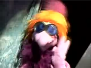
Rather than pick on a bad puppet film or show (there are sadly a lot to choose from) I decided to show you this example from Mr. Meaty because it’s a great series, I just don’t think that it’s well served by this particular shot:
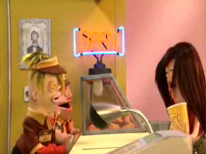
When you quickly glance at this screen capture, where do your eyes go? Mine are confused and sort of ping pong between the two characters on the left and the girl on the right. I don’t instinctively know where to look. Why it that?
I think that the problem is the composition of the shot; it isn’t well composed and has a number of problems:
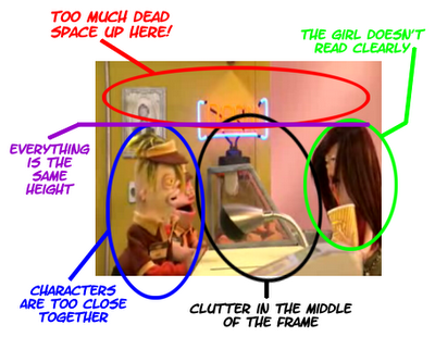
The middle of the frame has a lot of foreground and background clutter, which splits it in half. On one side there are two puppets who are overlapping each other and on the other a puppet who’s face is mostly obscured by its hair. Almost everything in the shot is the same height and there’s also a lot of dead space at the top of the frame. I can imagine the work that went in to designing and building these puppets, the props and the set. They’re all fantastic, but the basic composition of the shot is selling all that hard work short.
Remember that this isn’t a bad scene, it’s just that the camera got put in a less than ideal place. One possible solution (a favourite trick of director Brad Bird) is to lower the horizon in the shot. By positioning the camera lower and tilting it up the horizon line will drop lower in the frame, everything will appear to be at a different height and the shot will have an overall sense of depth. An added bonus is that when the camera is tilted up it’s easier to for puppeteers to keep their heads out of the shot.
Whenever you’re staging scenes with puppets you want to make the scene as clean as possible. The shot can be very detailed, but it should always read clearly. Good composition helps you do that. With one glance at a shot the audience should be able to tell exactly what is going on in it. A trick I was taught in film school that you can use to test how clearly a scene reads is to switch off the audio when watching a scene. If you can still have an idea what’s going on with no sound the scene has been well-staged. If not then there are likely some problems.
Now let’s look at the opening credits of another Canadian series, Wimzie’s House:
I’m not sure who directed the shots in the opening credits of this show, but they clearly knew what they were doing. The sequence starts with shots of several different characters. They are all nice and well-balanced with out being too tight or having too much dead space in the frame.
I especially like this one because it’s a dutch (tilted) angle, which makes it visually interesting.
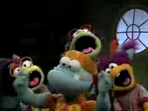
It’s usually impossible to prevent characters from overlapping in a shot staged like this, but here they are all visible once they pop in to frame and can be clearly read by the audience.
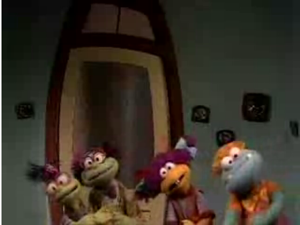
Sometimes bad shots happen to well-directed shows. I think there’s way too much dead space in the top of the frame here, but I’m not sure how you could stage this differently to avoid it. Despite that, notice how the scene is kept clean without lots of distracting props and that door in the background is framed off-centre so it doesn’t split the frame in half. Even though it was less than ideal situation someone was clearly thinking a lot about this shot.
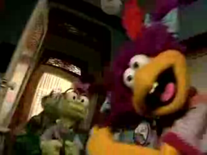
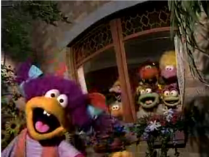
This is my favourite shot in the whole sequence. The shot is at an angle to make it dynamic and interesting, Wimzie (the main character) grabs our attention in the foreground while her pals come in the door in the background.
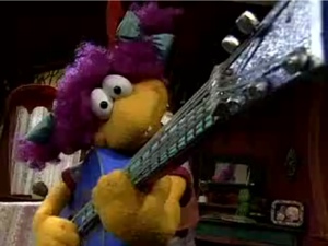
Another great shot. Seeing it in the opening credits out of it’s original context I’m not sure what they were trying to achieve with it, but notice how your eyes start out on Wimzie and then get drawn up the neck of the guitar. It’s an interesting shot with very sound composition.
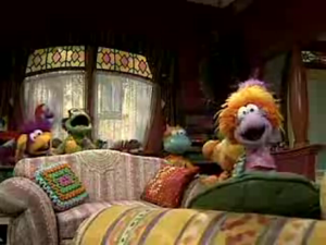
Wide shots are a curse when you’re doing puppetry for film and television because you can usually only shoot puppets from the waist up. In a shot with multiple puppets working with a (standard television) 4:3 frame that creates lots of dead space at the top of the frame. One possible solution to that problem is to stage the action on two levels like they did here.
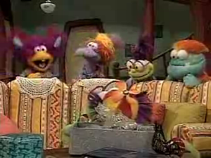
Another solution to prevent too much head space when lots of puppets have to be in a wide shot is to put the characters in the upper half of the frame and use a foreground objects like these couches to fill out the shot. I like how the couches are carefully positioned so that the viewer’s attention stays focused on the puppets. There is still a lot of dead space at the top of the frame, but that part of the set isn’t lit so the audience will likely just ignore it and focus on the puppets.
Wimzie is the star of the show so in the final shot of the sequence she’s letting us know by being right out in front here while the rest of the characters are in the background and inside the house.
These are just some random composition examples. You can pull both good and bad shots from almost every show. The important thing is that a good working knowledge of composition can help you make every shot better.
If you’re looking for some great tips on framing and composition from a master filmmaker you should download Brad Bird’s Notes on Composition (link goes to a .pdf file).
I also highly recommend the inexpensive book Setting Up Your Shots by Jeremy Vineyard.